Today we chose what actors we were going to have in our film. We needed a male of a reasonable age who was able to drive to the driver in our film. He would be dressed in a suit. We chose Gareth's dad as he didn't mind helping us and would be easy to arrange dates to film. We had other people in mind also to take this role such as some teachers from our school.
For the teenagers this was easier as we just need to find a group of people from a younger year who were willing to help us. We got Jon, Sean, Connor and Hayden to be part of our film. We got parental consent from all their parents which allowed us to film them.
Wednesday, 30 November 2011
Film Classification
 Typically horror films are a 15 or 18 age rating because of the content shown in the films isn't suitable to younger audiences. 15 films are allowed to contain strong horror and dangerous behaviour therefore allowing our film to fit this category. Using this age rating give us the use of bad language with nudity with no stong detail. The 15 age rating allows sex to be portrayed without strong detail while containing strong violence but cannot focus on pain.
We thought about having our film as an 18 because we wouldn't be restricted on the blood and pain aspect of our film as much. But we decided against it as this would restrict the viewers for our film potentially damaging profits if it was ever to be released as a proper film.
Filming Style
We decided today that the style of filming for our film will typical of a horror and most other Hollywood films. Its simple with a mixture of angles, movements and timings for each shot. We also decided that during the editing process we were going to darken the shots by adding filter effects from Final Cut Studio.
Music
Today we chose the music for our film. This was difficult because needed music which fit the genre of horror plus was copyright free.
The first track we chose was 'The Hyperborean Menace' which we found at machinimasound.com. They provide free copyright free music to video producers. This track fits well with our film because it climaxes at the end then becomes very quiet and mysterious afterwards.
The other track we chose to use as background music to for our first scene. This was 'Aftermath' from incompetech.com. This also works well with our film because of the mood and feeling of the music.

Production Company
Our production company name is DiGiTal Media. We chose this name because of 'Digitial Media' is a connatation of film production. The D, G and the T are in capitals because those are from our names, Dom, Gareth and Tom.
Our logo was designed using Sony Vegas. The font used was ____ and I made it 3D. This makes the look like our company has an edge showing we are very good at what we do.

We added a background and added movement to the text for our intro to make fit better with the genre of horror. The background was a red and dark bubble effect are good colours to use to connote evil and horror.

 Above was our first concept, this was before we decided on the DiGiTal instead DGT.


Our logo was designed using Sony Vegas. The font used was ____ and I made it 3D. This makes the look like our company has an edge showing we are very good at what we do.

We added a background and added movement to the text for our intro to make fit better with the genre of horror. The background was a red and dark bubble effect are good colours to use to connote evil and horror.
We had tried a few other ideas before deciding on what we had above.
Once we changed the name, we decided to have a 3D effect. You can see that we kept the 3D idea in our final logo.

Settings


Today we went location hunting for where we would want to film our horror film. We were looking for a remote location but with buildings near by. Because the scene was based on a road, we needed to find a quiet road so we were not constantly interrupted during filming.
We used two different locations to film, both on the same road. The first location had a warehouse in the background and house to the right. We used this location because it look like we were on the edge of a town or other built up area.
Location two was further up the road and looked liked it was in the middle of nowhere. We used this location because it contrasted well with the other location. This location also had a large pothole which we are planning to use for a shot when the car drives through it when it is filled with water.
We had a look at two other locations but because of their location we decided against them. There was traffic noise noticeable at one location and the other location we thought was too remote for our purposes.
Tuesday, 29 November 2011
Props
Today we made a brief list of items we would need for the film.
- Ketchup for blood.
- Car
- iPod with Headphones.
Friday, 18 November 2011
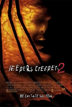
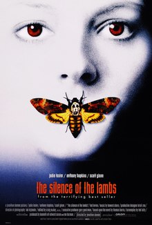
Research of Horror Films
Friday, 11 November 2011
Production Company Logos
This post is about the logos of productions companies and how they produced to connote the good films they produce.
 20th Century Fox
Big budget studio shown by bold golden logo standing out being taller than everything around it connoting that it is standing out from the rest.
 Dreamworks
On the moon, showing their above the rest when it comes to films. With the company name, Dreamworks also makes people think that their films are films of your dreams. Also to show how good their productions, the logo
 Film4
Film4
The logo is very simple and shows simplicity of what it does with the large word 'Film'. The bold red colour stands out and is eye-catching.
 Paramount
The paramount logo shows a mountain high up and on top of everyone else. This is what Paramount want you to think about their films showing that they are the best.
 Universal
There logo shows the world and how they cover all aspects of it with their films. With the world glowing, its shows that they are proud of their films and they want to show the universe what they have made.
 Vertigo Films
The bright red logo stands out and being bright makes it easily noticeable. The world vertigo meaning fear of heights could be interpreted as other companies should fear them because they are going to the top of the film making industry.
 Warner Brothers
The logo is up in the sky with clouds behind showing their "high up there" in the film industry. Also the golden WB emblem, similar to Fox shows class in their films.
20th Century FoxBig budget studio shown by bold golden logo standing out being taller than everything around it connoting that it is standing out from the rest.
DreamworksOn the moon, showing their above the rest when it comes to films. With the company name, Dreamworks also makes people think that their films are films of your dreams. Also to show how good their productions, the logo
Film4The logo is very simple and shows simplicity of what it does with the large word 'Film'. The bold red colour stands out and is eye-catching.
ParamountThe paramount logo shows a mountain high up and on top of everyone else. This is what Paramount want you to think about their films showing that they are the best.
UniversalThere logo shows the world and how they cover all aspects of it with their films. With the world glowing, its shows that they are proud of their films and they want to show the universe what they have made.
Vertigo FilmsThe bright red logo stands out and being bright makes it easily noticeable. The world vertigo meaning fear of heights could be interpreted as other companies should fear them because they are going to the top of the film making industry.
Warner BrothersThe logo is up in the sky with clouds behind showing their "high up there" in the film industry. Also the golden WB emblem, similar to Fox shows class in their films.
Subscribe to:
Posts (Atom)